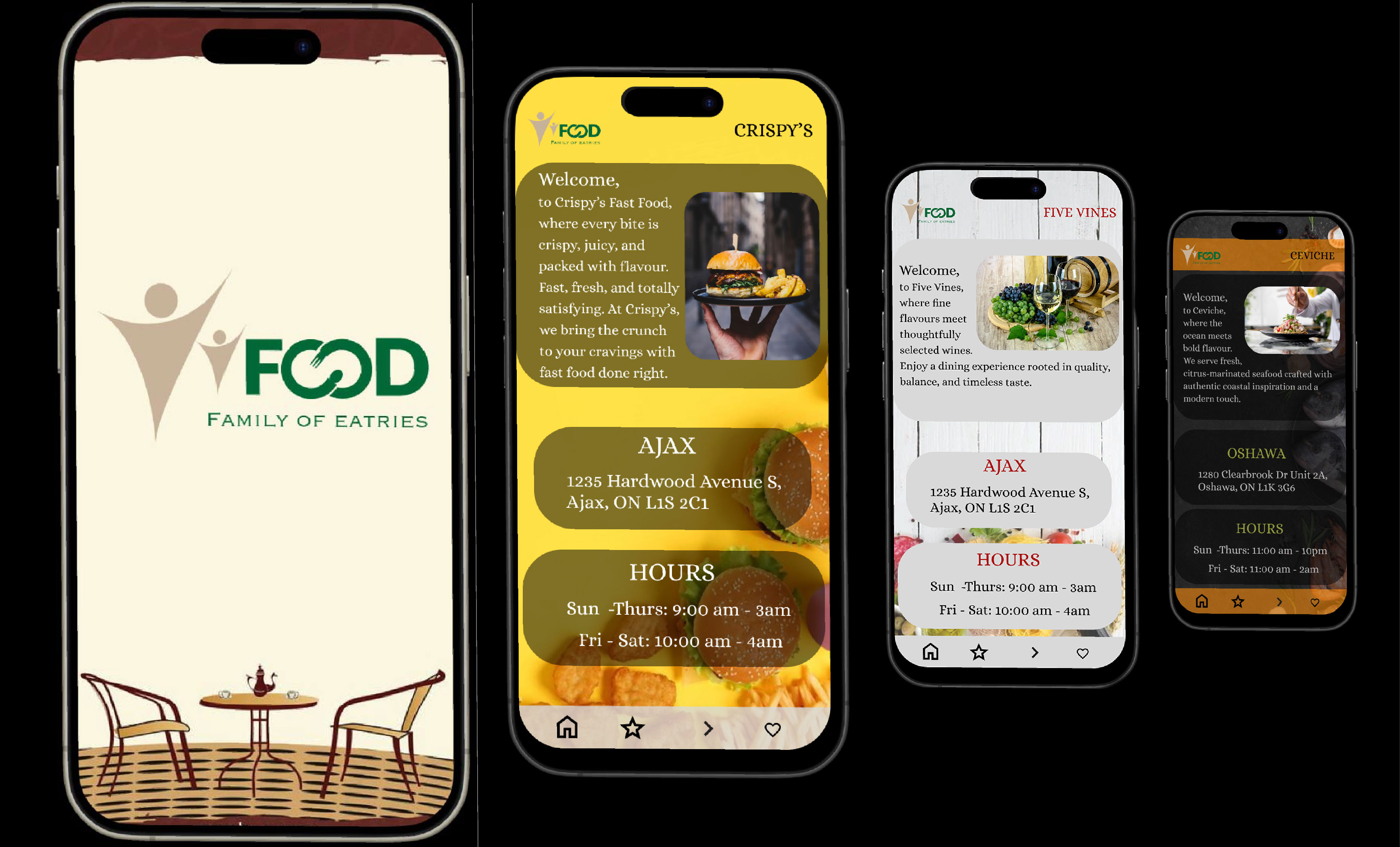
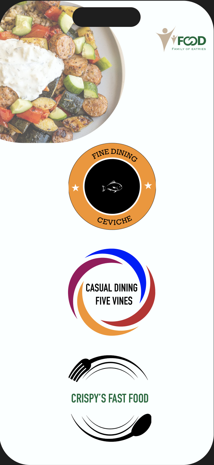
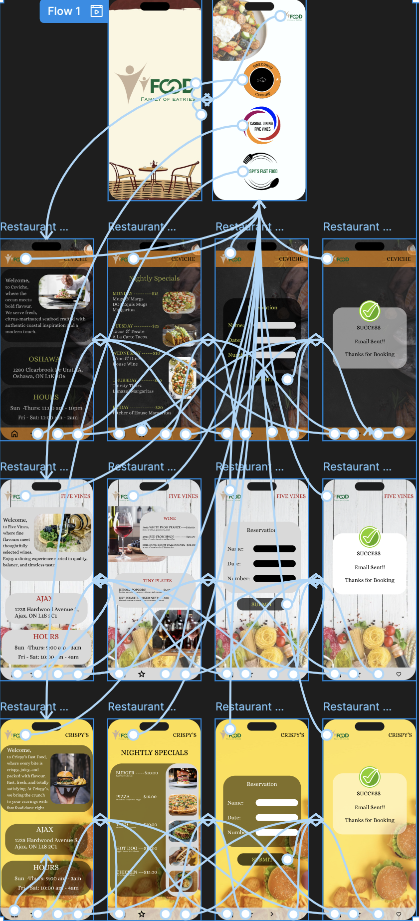
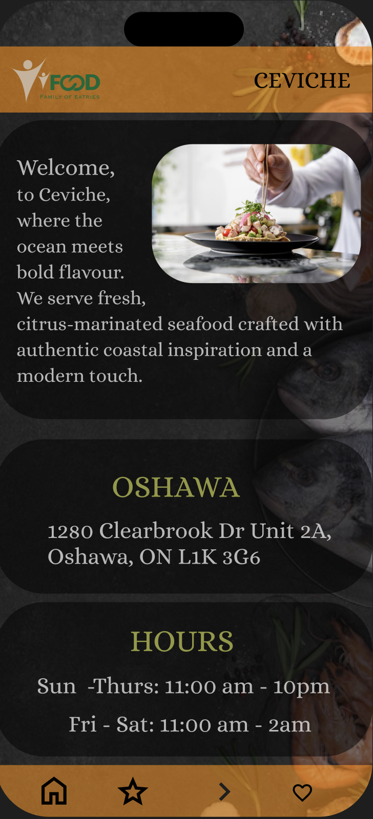
Family Of Eateries is a comprehensive mobile-first application designed to unify multiple restaurant brands under a single, seamless digital platform. The app allows users to browse menus, make reservations, and place orders effortlessly, all while maintaining each brand’s identity and style. By focusing on intuitive navigation, responsive layouts, and accessibility for all users, the project ensures a smooth experience across devices. Key features include personalized recommendations, streamlined checkout, real-time availability updates, and an interactive interface that reduces friction and enhances user satisfaction.
The Family Of Eateries project was aimed at creating a cohesive mobile-first platform for multiple restaurant brands. Users often struggled with fragmented apps and inconsistent menus. This project consolidates all brands into a single interface, providing a smooth, intuitive experience for ordering, browsing menus, and managing reservations. The interface prioritizes accessibility, performance, and user satisfaction.
The main challenge was to unify multiple dining brands with different menus and branding into a single, intuitive application. Ensuring usability across devices while maintaining brand integrity required careful planning and user testing.
Research revealed that users prioritize quick access to menus, simple ordering flows, and clear checkout processes. Competitive analysis of leading food-ordering apps highlighted the need for consistent navigation, minimal friction in ordering, and clear visual hierarchy.
Wireframes were developed to establish the foundational layout and structure of each screen, ensuring usability and clarity before moving into visual design. Each screen was carefully planned to prioritize key user tasks, such as browsing menus, placing orders, and making reservations efficiently. Wireframes focused on the hierarchy of information, spacing, and intuitive navigation patterns to reduce cognitive load for users. By using low-fidelity wireframes initially, we were able to quickly iterate on user flows, validate the structure with stakeholder feedback, and identify potential usability issues early in the design process.


High-fidelity UI designs translated the approved wireframes into visually polished screens, showcasing the final look and feel of the application. Typography, color palettes, and brand assets were applied consistently across all screens to maintain a cohesive identity. Attention was given to interactive elements like buttons, toggles, and transitions to provide visual feedback and enhance user engagement. High-fidelity screens also incorporated accessibility considerations, ensuring legibility and contrast for all users. This stage allowed stakeholders to experience a realistic version of the app and provided clear guidance for development.


The interactive prototype demonstrates user flows, transitions, and interactions. It allows stakeholders to experience the app before development, providing feedback on navigation, responsiveness, and overall usability.
This project reinforced the importance of research-driven design and iterative prototyping. It highlighted the challenges of maintaining usability while consolidating multiple brand experiences into a single platform.
Moving forward, I would implement more extensive usability testing and analytics to optimize the checkout flow. This project strengthened my skills in responsive design, interface consistency, and UX problem solving.